In the domain of web design and digital marketing, it’s widely acknowledged that well-crafted call-to-action (CTA) buttons play a pivotal role. These small yet crucial elements act as navigational markers, profoundly influencing user behavior and holding the potential to significantly boost a website’s conversion rates. Nevertheless, what might surprise you is the substantial impact that the choice of text case for your CTA buttons can have on user engagement and the success of conversions. In this blog post, we will explore the art of selecting the appropriate text case for your CTA buttons, elucidating how this decision can enhance their effectiveness, improve the user-friendliness of your website, and ultimately contribute to an increase in your conversion rates.
The Power of a Call-to-Action Button
Before delving into the specifics of text case, it’s important to understand why CTAs are so vital to the success of any website. CTAs are like digital signposts that guide users on their journey through your site. They tell users what action to take, whether it’s making a purchase, signing up for a newsletter, or requesting more information. Well-designed CTAs can turn casual visitors into engaged users and, ultimately, paying customers.
The Role of Text Case in CTAs
When it comes to CTAs, the choice of text case can greatly influence their effectiveness. Let’s break down the impact of various text cases on CTAs and explore when to use each one for maximum engagement:
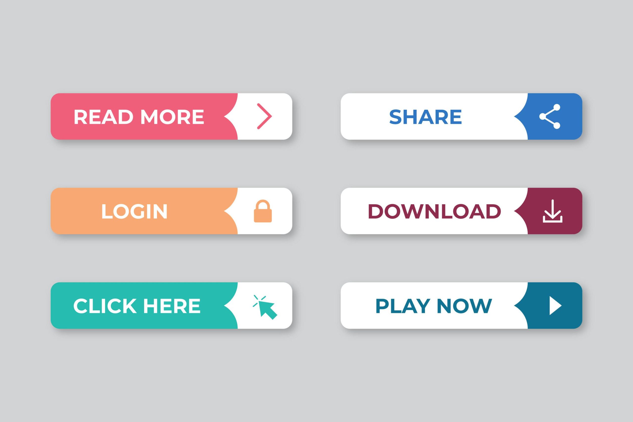
1. UPPERCASE: “ACT NOW!”
Attention-Grabbing: Uppercase text case is perfect for creating a sense of urgency. It’s loud and attention-grabbing, making it ideal for time-sensitive offers or promotions. However, use it sparingly as constant shouting can diminish its impact.
2. Title Case: “Learn More”
Clarity and Readability: Title case is an excellent choice for CTAs that prioritize clarity. It maintains the readability of text, which is crucial when you want your CTA to be instantly understood by users.
3. Sentence Case: “Sign up for our newsletter”
Friendly and Inviting: Sentence case is more conversational and less formal. It’s great for CTAs that aim to create a welcoming atmosphere or encourage users to take a less intimidating action.
4. Lowercase: “read more”
Minimalistic and Subtle: Lowercase text case works well for minimalist designs and subtle CTAs. It’s perfect for blending the CTA seamlessly into the overall design while still being noticeable.
5. Mixed Case: “Learn More”
Balanced Approach: Mixed case, which combines both uppercase and lowercase letters, offers a balanced approach. It can provide emphasis without being overly aggressive.
6. Alternating Case: “cLiCk HeRe”
Playful and Fun: Alternating case can add a playful element to your CTAs, making them stand out and encouraging interaction. However, it’s not suitable for all situations, so use it wisely.
Tips for Choosing the Right Text Case
Understanding your audience is crucial: Familiarize yourself with your target demographic and determine the text case that resonates most effectively with them. Younger audiences tend to engage positively with uppercase or alternating case, while a more mature demographic often prefers title case or sentence case. It’s important to tailor your approach to suit your specific audience’s preferences.
A/B Testing: Experiment with different text cases through A/B testing. Test multiple versions of your CTA buttons to see which one performs the best in terms of click-through rates and conversions.
Consistency: Maintain consistency in text case throughout your website. Use the same text case for all CTAs to avoid confusion and create a unified user experience.
Placement: Consider the placement of your CTAs. Sometimes, an uppercase CTA at the beginning of a sentence can be more effective, while a lowercase CTA at the end of a paragraph may work better in a different context.
Visual Contrast: Ensure your CTA buttons have visual contrast. The text case should stand out against the background to catch the user’s eye.
Real-World Examples
Let’s take a look at a couple of real-world examples of websites using text case effectively to create impactful CTAs:
Amazon uses a mixture of uppercase and lowercase text case for its “Add to Cart” CTA. This design emphasizes the action and blends well with the overall website aesthetics.
MailChimp employs sentence case for its “Sign Up Free” CTA. This choice makes the CTA feel friendly and approachable, encouraging users to take action.
Conclusion
In the domain of web design and digital marketing, it is vital to underscore the significance of dedicating scrupulous focus to every aspect, regardless of how apparently inconsequential it may seem. The selection of text case for your call-to-action buttons, even if it might seem insignificant, holds the potential to yield a noteworthy influence on user engagement and the conversion rates of your website. By grasping the subtleties associated with various text cases and purposefully incorporating them, you possess the capacity to shape persuasive CTAs that establish a connection with your audience and motivate them to carry out the intended actions.
Remember that there is no one-size-fits-all solution. The key is to align your text case choices with your brand, your target audience, and the specific goals of each CTA. By carefully considering and testing different text cases, you can transform your CTAs into powerful tools that guide users toward meaningful interactions and ultimately lead to higher conversion rates.